Prime Time Rehabilitation
Introducing Prime Time Rehabilitation, a mobile physiotherapy and kinesiology clinic that primarily serves Burnaby, New Westminster, and Coquitlam BC. Embracing its status as a fresh addition to the healthcare scene, Prime Time Rehabilitation is dedicated to empowering patients to reclaim control over their recovery journey and enhance their overall lifestyle.
Tasked with the project, I envisioned and crafted the clinic's vibrant branding identity and designed a dynamic, responsive website, perfectly capturing the energetic and inviting ambiance.
Project
- Responsive Web Design
- Visual Branding
Tools
- Figma
- Adobe Illustrator
- Sketch
Skills
- UX Research
- Mobile-First Design
- Wireframing
- Low to High-Fidelity Protoype
- UI Design
Opportunity
Since the kickoff meeting, we knew we had to differentiate Prime Time Rehabilitation from other mobile health clinics in order to generate new patient interest. As my client didn't have a strictly defined branding concept, I was also free to explore new visual directions in my design.
Goal
As a small business just starting out in the midst of a global pandemic, the main goal of this project is to engage potential patients and pique visitor interests in clinic services. In addition, we would also like to create a brand identity that embodies the unique characteristics of Prime Time Rehabilitation as it establishes itself in the healthcare industry.
Clinic Credibility and Information are Key
Through user research, we learned that patients automatically look for referrals and reviews when visiting a new physiotherapy/kinesiology clinic. This is especially important if they had come across the clinic through a search engine.
Though not all required, additional clinic information, such as mission, history, and team, helps healthcare clinics build personal connections with their patients. Clinic locations and mobile site accessibility further promote user booking behaviour.
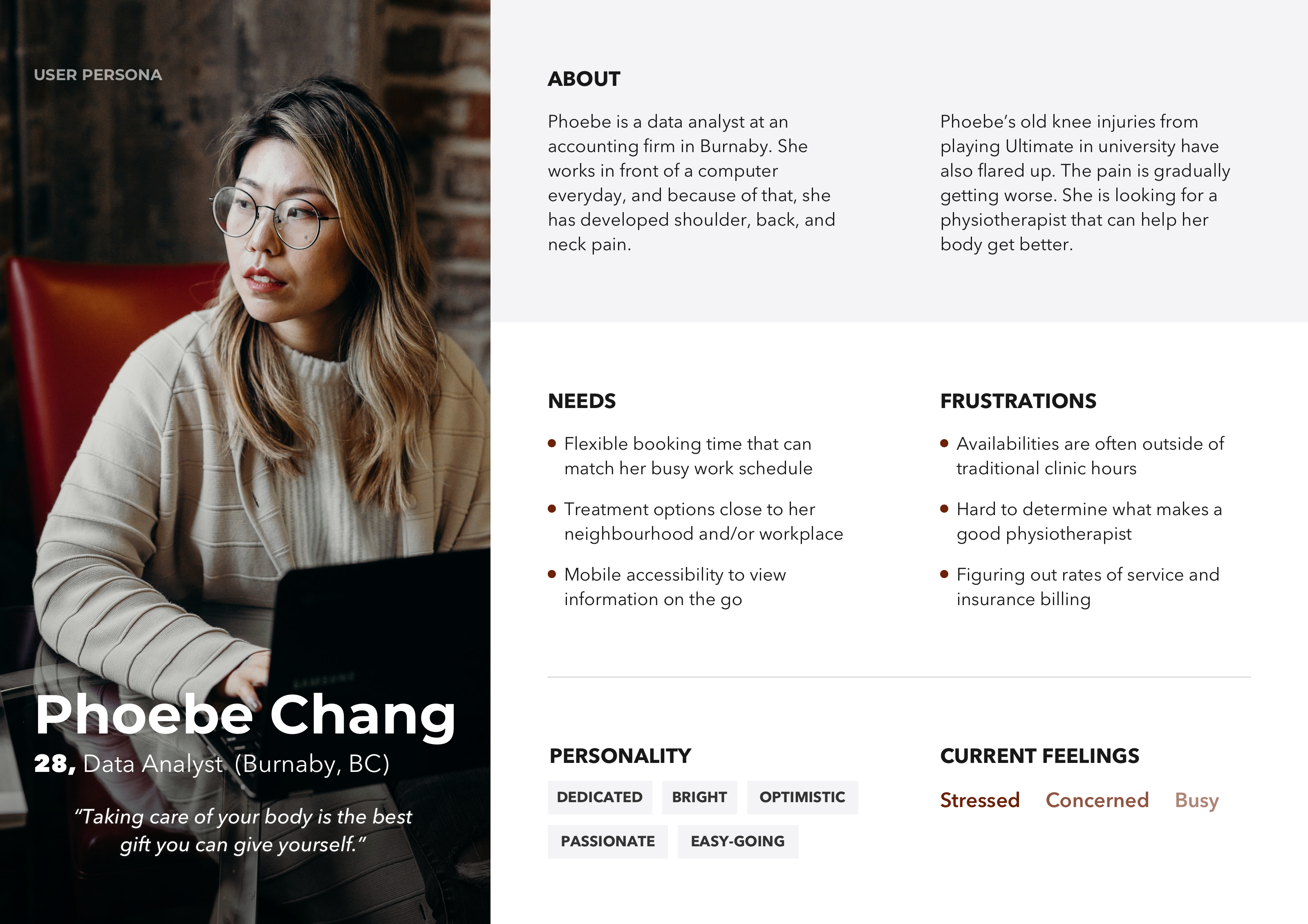
Compiling the research findings, I built a user persona to direct my planning and design processes.
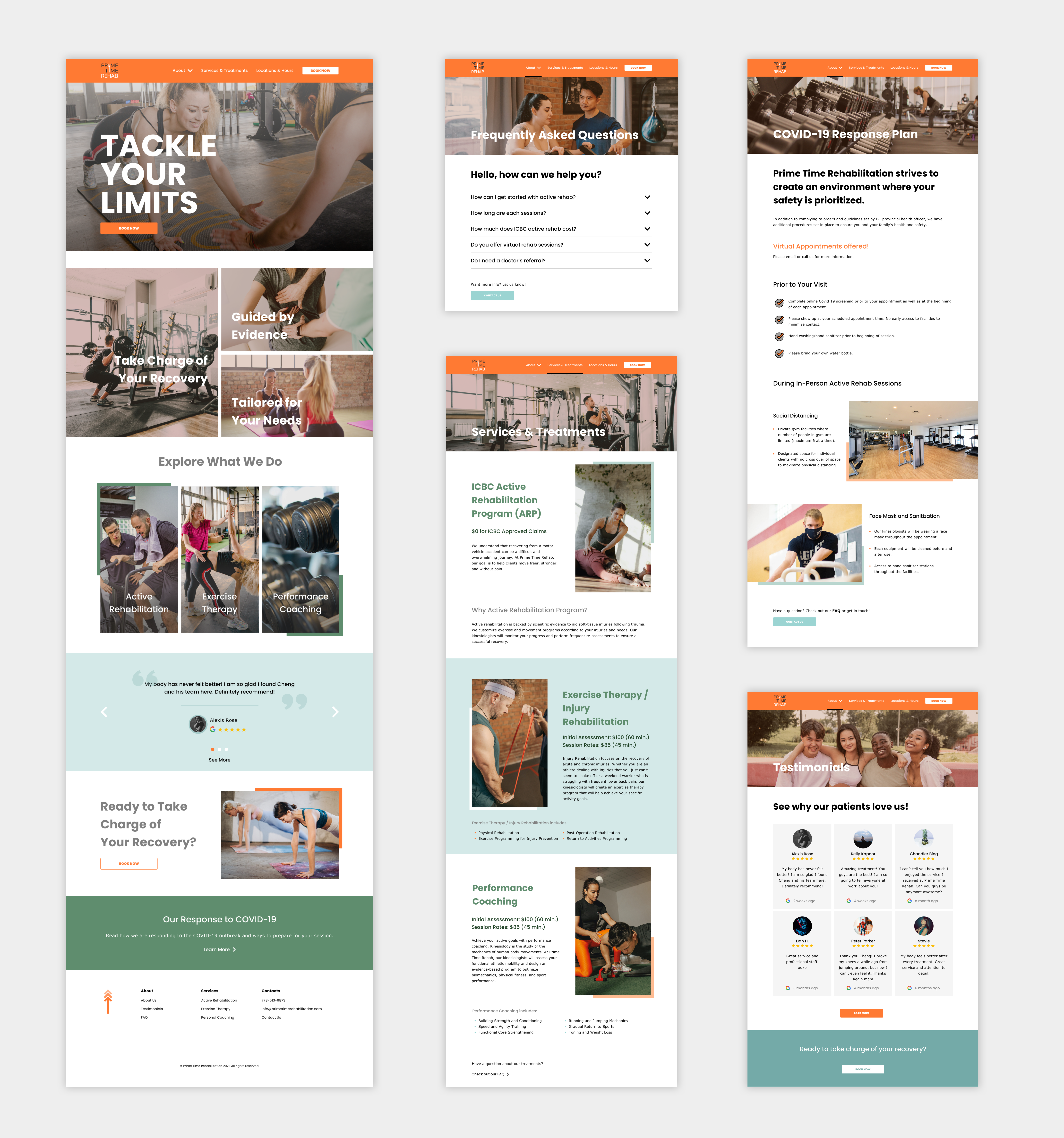
Creating Unique Experience based on User Needs and Interaction Context
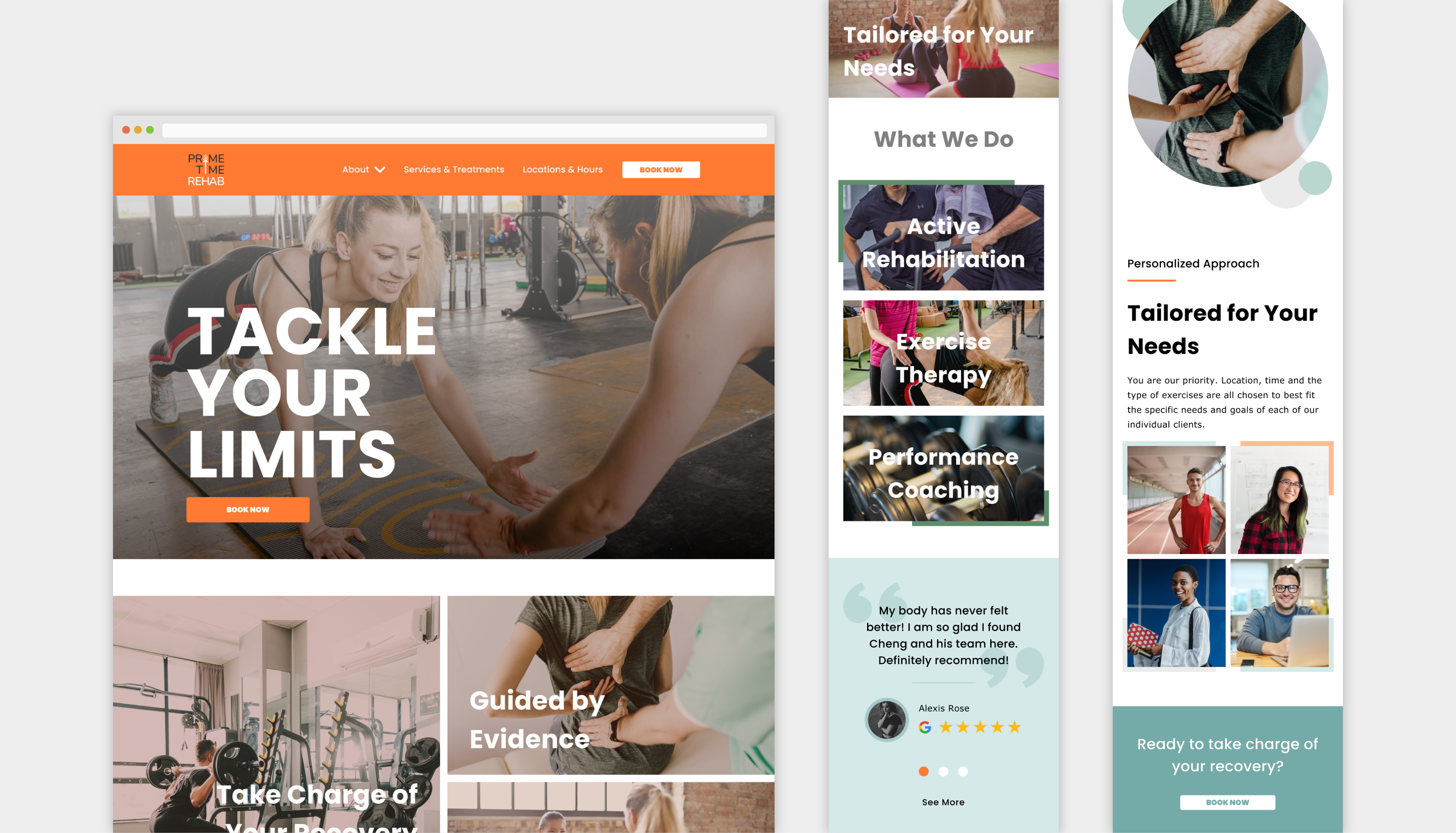
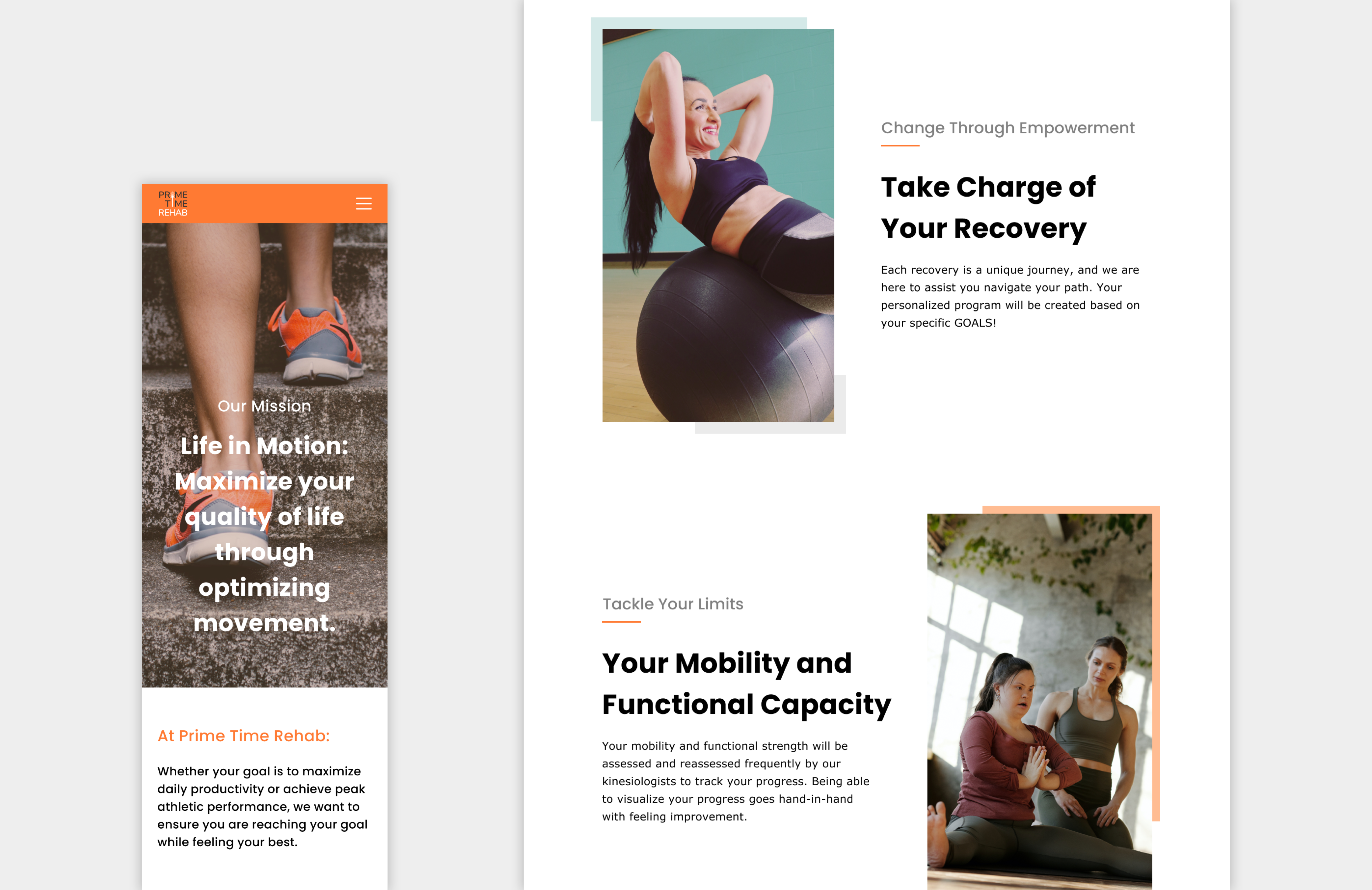
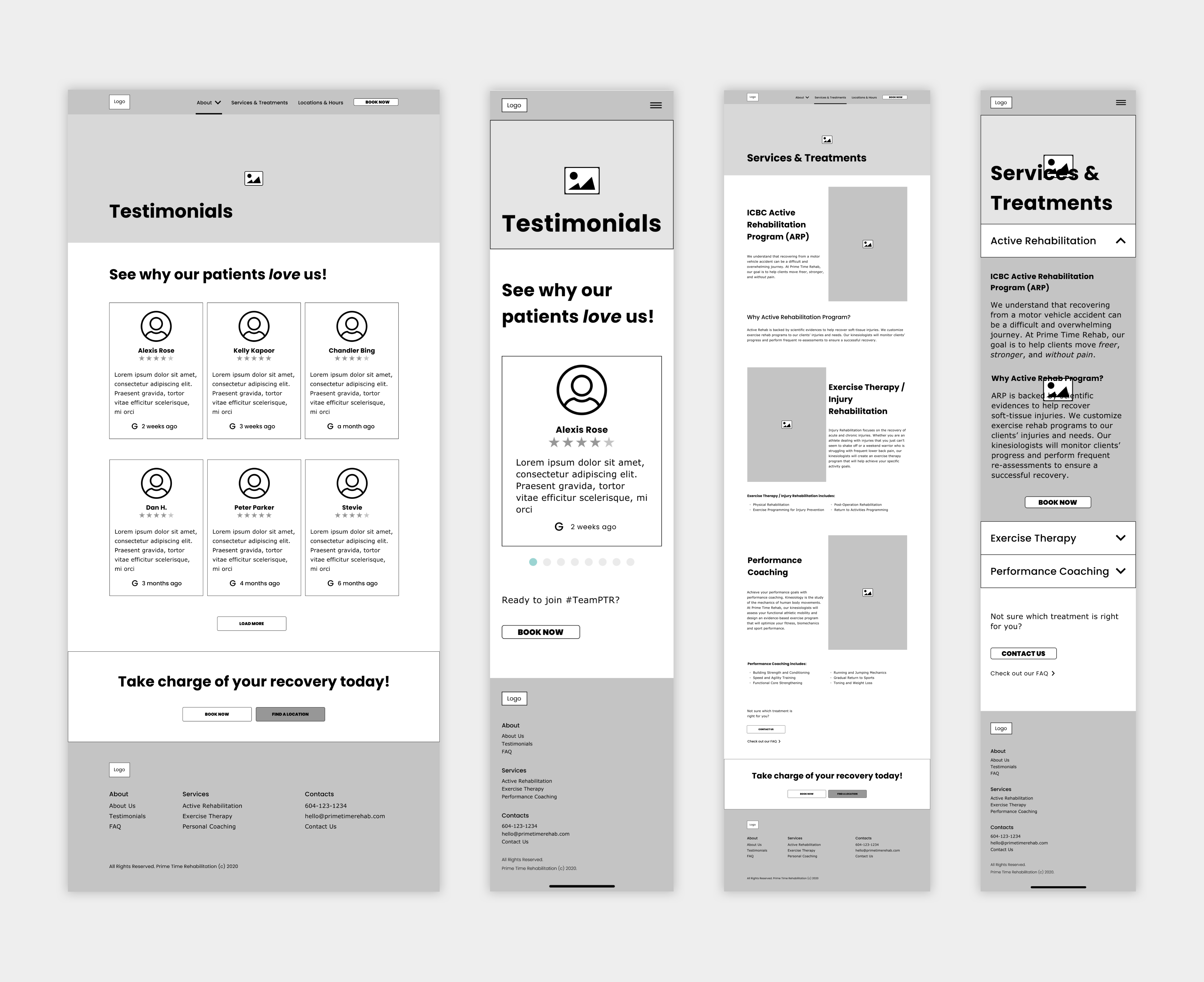
To deliver content based on the context of user's interaction, I begin to create wireframes starting from Phoebe's mobile needs. In addition to improving users' mobile accessibility, the mobile-first approach offers an unique experience depending on users' choice of device.
I then iterated my design through usability testing in order to validate and align with user behaviours. Following feedback and test suggestions, I restructured component layouts, modified copies, and simplified guiding elements.
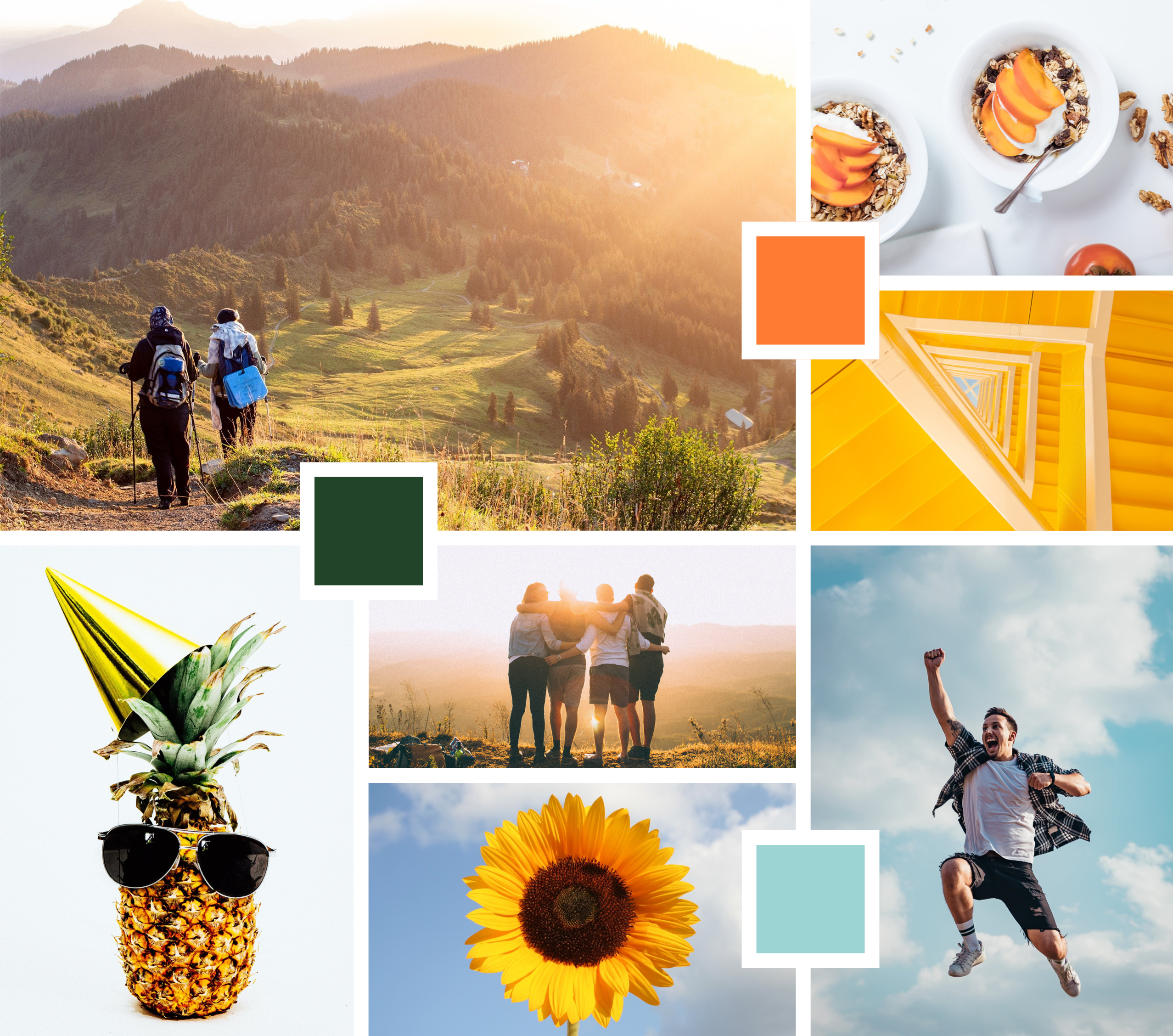
Warm, Energetic, and Human
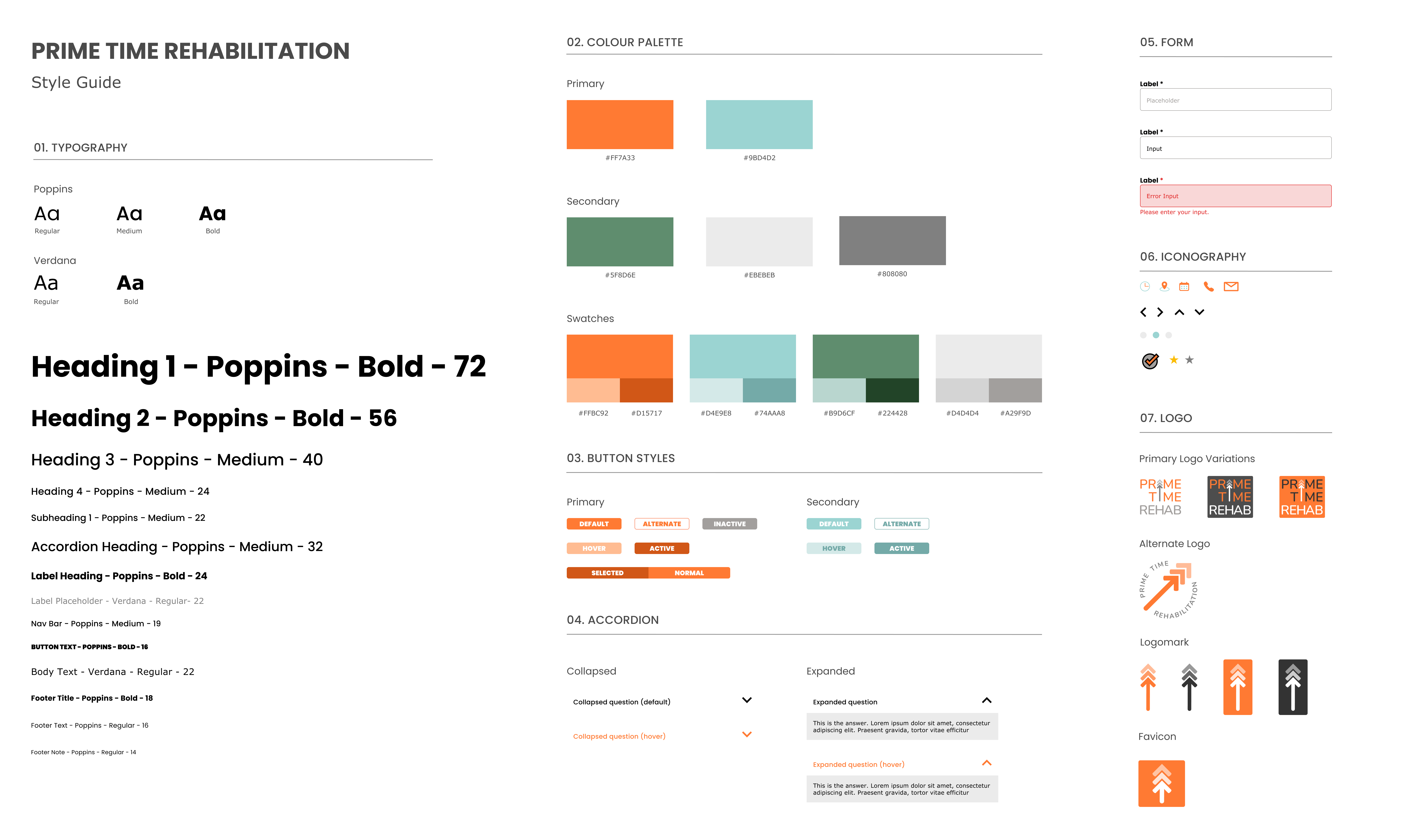
To embody the essence of Prime Time Rehabilitation, I put together a mood board inspired by the outdoor lifestyle, living energy, and personal journey. Using the theme of the mood board, I further developed a style guide experimenting with various bright colours organically found in nature.
Logo Designing for A Journey
I remember during one of our initial meetings, I asked my client what they would like people to think of when they hear the words "Prime Time Rehabilitation". He thought for a few minutes and said,
"A journey."
I loved that answer, and it really stuck to me as we were brainstorming for our logo designs. There were several ideas in the air that focused on reflecting the clinic's active lifestyle and positive values. However, none of them felt quite right to me, and I find myself circling back to this conversation. I decided then to explore the core beliefs of Prime Time Rehabilitation: journey and personal growth .
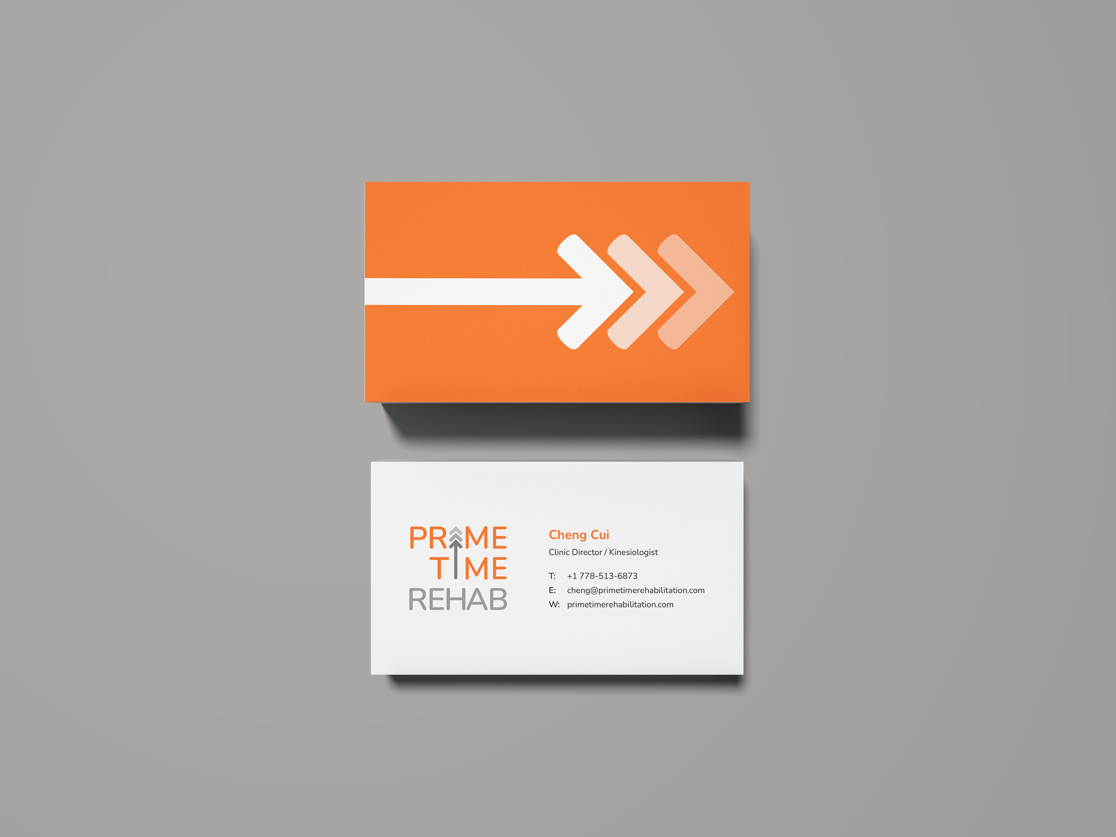
Stemming from the concept of path arrows, I adapted the letter "i" from "Prime Time" into an upward arrow to symbolize a continuous journey. Combining the arrow with two faded chevrons, a minimal geometric tree is formed to illustrate the idea of growth and life .
I further included the name, "Prime Time Rehabilitation", into my logo to promote brand awareness for the new clinic. Nunito was chosen to be used in the logotype for its well-balanced characters and rounded edges, reinforcing the soft and friendly environment of Prime Time Rehabilitation.
The result is a simple yet meaningful Arrow Tree .
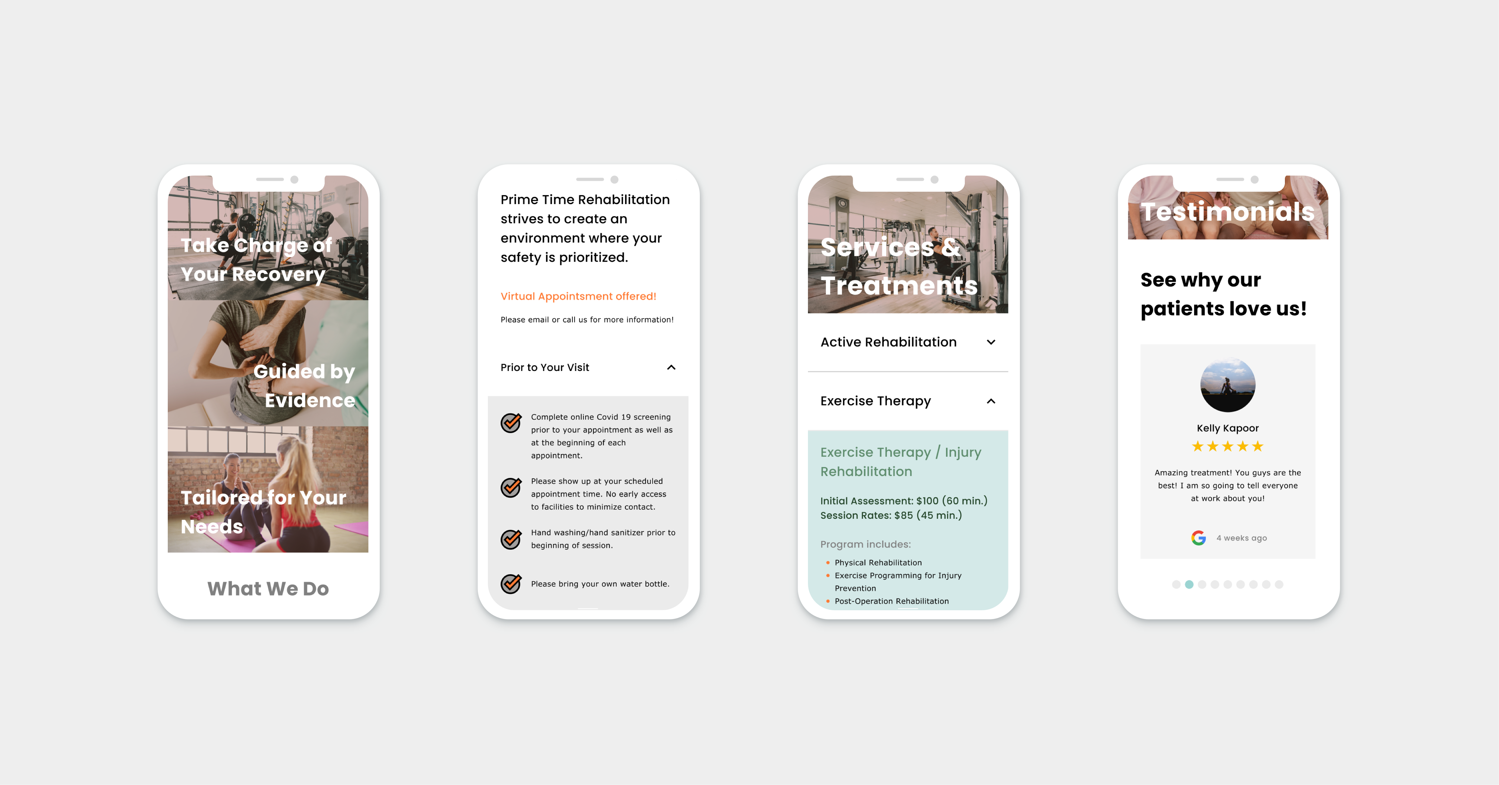
The Result: Fluid, Welcoming, and Inspiring
The Lesson of Designing by Core Values
Working with Prime Time Rehabilitation was an absolute joy, and I have learned so much from this project. I appreciate the creative freedom and trust my client instilled in me. It was a lot of fun experimenting with vector drawings and exploring branding concepts.
Instead of blindly following design trends, this project has taught me the value of designing at the core. To see my client's face light up and nod in agreement as I present my design was a true delight. I am very grateful I got to be a part of Prime Time Rehabilitation's journey, and I can't wait to see where our paths will lead us!